HTML tables let you position images, text, and other elements precisely on your Web pages. In our last Under Construction, we explained how to build basic HTML tables (you'll find previous bLink tutorials and other Web page building resources online). This month, we'll cover additional HTML table tricks and show you how to use them for more advanced Web page layouts.
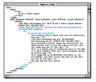
Let's begin by looking at Figure 1. Many Web sites use tables to present text in columns, just like newspapers and magazines do. There's a good reason for adopting this print convention on the Web: readability. It's much easier for a reader to digest information presented in narrow columns. And even if you don't want to use multiple columns on your pages, you may want to format your text in a single narrow column.
Figure 1 shows this single-column approach. The page uses a very simple table — just one row and one cell — basically a box filled with text and the image of bLink holding his hammer and toolbox. (Note that the "bLink's Table Layout" banner at the top of the page is NOT inside of the table.) All the table contents go between the <TD> and </TD> tags. By defining the dimensions of the table (using HEIGHT and WIDTH attributes), we set the width of the column, then simply fill it with the text and image as we would on a page without a table. It's an easy, effective way to present text, especially long articles.
We use one new attribute in Figure 1: VALIGN, which stands for "vertical alignment." VALIGN lets you position the contents of a cell at the TOP, MIDDLE, or BOTTOM of the cell. In Figure 1, we use <TD VALIGN=TOP> to begin our text at the top of the cell. Without this attribute, the cell contents would be centered vertically, leaving unwanted space at the top and bottom.
We also use the ALIGN attribute within the <TD> tag. When used this way, ALIGN positions the cell's contents horizontally, either LEFT, RIGHT, or CENTER. The attribute <TD ALIGN=LEFT> in our example left-justifies our text within the cell.
(Note: If you have more than one cell, you can use VALIGN and ALIGN attributes within the <TR> tag to align all the elements in all the cells of a row, eliminating the need to define these alignments in the <TD> tags for every cell.)
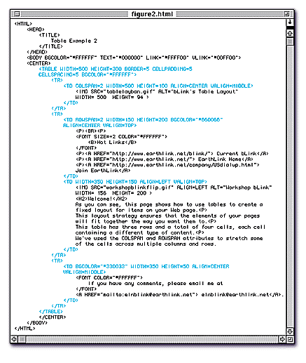
Figure 2 shows a more advanced, but common, table-based Web page layout: a title bar on top, a navigation bar on the left, and a main content area in the center and on the right side of the page. We also added a cell at the bottom to separate bLink's email address from the rest of the text.
The table in Figure 2 has three rows. The first row contains one cell with the page's banner graphic, "bLink's Table Layout." The second row contains two cells: the Hot Links bar and the main content area (i.e., the welcome message and bLink's image). The third row contains one cell with bLink's email address. So, we have FOUR distinct content areas, created by four table cells with defined attributes (width, height, alignment, etc.) for each cell.
Notice that each cell has both ALIGN and VALIGN attributes. The title graphic in the first cell is centered horizontally and vertically using ALIGN=CENTER and VALIGN=MIDDLE. The links in our navigation bar are centered horizontally and positioned at the top of the table using ALIGN=CENTER and VALIGN=TOP. And the text in our main content area begins at the top and is left-justified because we used ALIGN=LEFT and VALIGN=TOP.
What's new here is that we are using different numbers of cells in each row and that some cells stretch across multiple columns and rows. We accomplish this by using two new attributes: COLSPAN and ROWSPAN. These attributes always appear within <TD> tags.
COLSPAN will stretch, or "span," a cell HORIZONTALLY across the number of table columns you specify (in an HTML table, "columns" are defined by the number of cells in a row). In our example, we created the wide cell for the banner by using COLSPAN=2. The value "2" indicates that the banner will span two columns: the Hot Links column and the main content area. (Without a COLSPAN attribute, table cells will span only one column by default.)
ROWSPAN stretches a cell VERTICALLY down the number of rows you specify. We wanted the cell containing our Hot Links to span two rows (the main content area and the email address row), so we used the ROWSPAN=2 attribute.
You won't know when to use COLSPAN or ROWSPAN in your tables if you don't plan ahead and sketch out your table with good, old-fashioned pencil and paper. Draw how you want the table to look, number all the rows and columns, and identify the cells you need to span. It's not high-tech — but it's a quick and effective way to figure out the attributes you'll need for your table.
Without using COLSPAN and ROWSPAN, if you created one table row with one cell and then the next row with two cells, your table would display with a blank filler space in the first row. Browsers like to display uniform tables with equal numbers of cells in each row. So, if you don't span the single cell in the first row, browsers will compensate by inserting filler space where they expect a second cell, resulting in an awkward-looking table.
Figure 2 also shows the importance for table layouts of defining WIDTH and HEIGHT attributes. For instance, the only way to make our Hot Links cell narrower than the cell next to it (the main content area) is to define its pixel width; we used WIDTH=100.
If we removed this attribute, the browser would make both cells the same width, defeating the purpose of our layout. In general, whenever you can, specify WIDTH and HEIGHT attributes to gain more control over the dimensions and appearance of your table.
Using the concepts you've learned in this tables tutorial, you can create a variety of effective and attractive table-based page layouts. Experiment with different cell and row combinations to find what works best for you. With practice, you'll soon be a tables aficionado, and it'll show on your Web site.